The philosophy of the space for children by XYstudio
You don't have to be a fortune teller to know that these are our children who would design the space we live in in the upcoming future. You don't have to be a pedagogue neither to know that we form our children's sense of aesthetic and support (or not) their sensitivity to the surrounding world from the very first moments of their lives. The conclusion is simple: we should attach importance to the aesthetic education of our children. Hence, we should provide them places which would treat them as a sensitive recipient, who need order, harmony and clear principles of arranging space.
Most common mistakes committed while creating space for children are chaos and lack of consequence which are most visible in unconsidered space arrangement, accidental colours and a mixture of patterns and cartoons' characters on the walls and on the floor.
Architects from XYstudio have created their own philosophy of the space for children, basing on their experience and discussions with pedagogues and psychologists. “Our aim is to create a safe and non-aggressive place, which would be interesting and – what's most challenging – inspiring and easy to rearrange, reinterpret and adapt by children. Such space would develop kids' imagination and would be attractive to many children.”
If you agree with their philosophy, below you would find the tips how to achieve this aim:
- The priority should be safety and good organization. It is helpful to separate the space for fun, art and craft and reading to make keeping order easier and to provide children safety and calm when they need it.
- Colours should harmonize with the function of the space. In kids rooms and nurseries, where children spend much time the space should be bright, sunny and relaxing (or at least not tiring). The colours should be light and rich but limited in amount. In kids' clubs colours can be more fanciful but also rich and optimistic.
- Important element of the kid's space is a hiding place, loved by children. If possible provide it in kid's room and in kids' club, however it should be carefully considered in nursery where teachers may have problems with getting little deserters out of there.
- While decorating, try to avoid beloved cartoon characters as they are very limiting in their literal meaning.
- Choose more abstract designs, which could be interpret freely by children.
- The abstraction level should be suitable for child's age.
Following the above tips you may succeed in creating something more than a space with furniture and toys – a space which is a toy itself and which stimulate your child's development. Good luck.
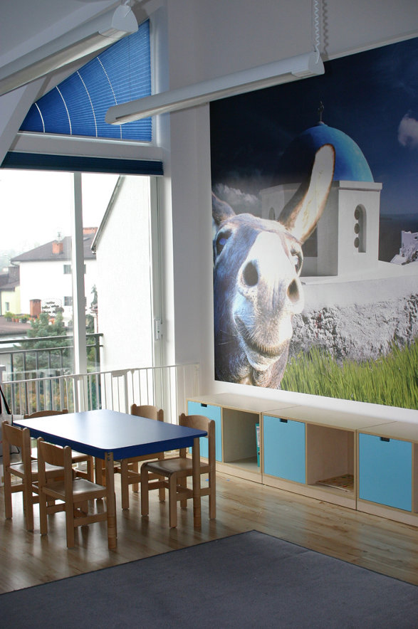
Greek class in Baby City nursery school
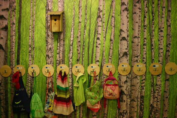
In or out? Baby City nursery school cloakroom
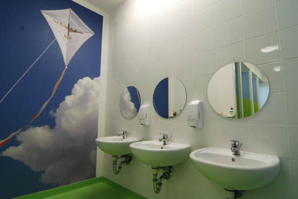
Toilet in Baby City nursery school
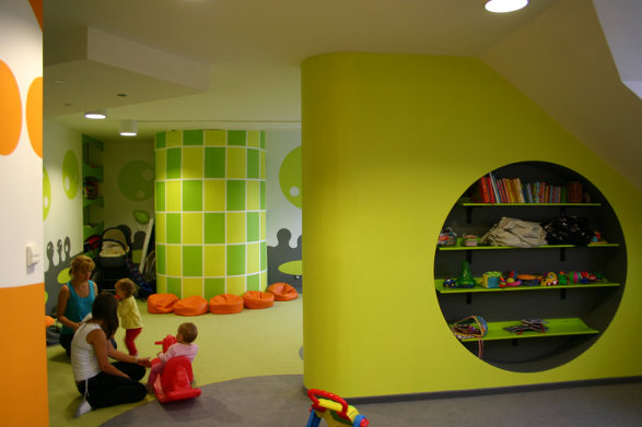
Storage spaces in Mars room (Baby City nursery)
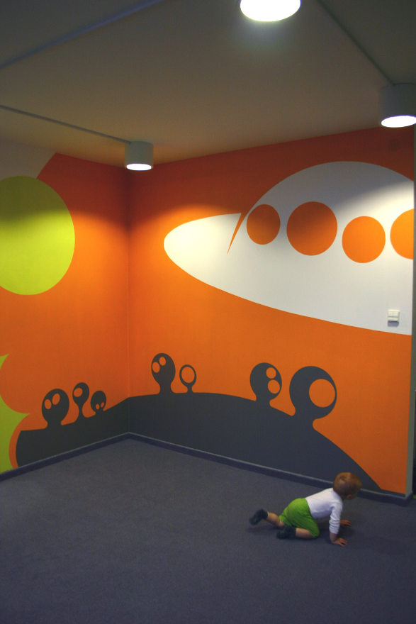
Abstract wall decoration in Mars room (Baby City nursery)
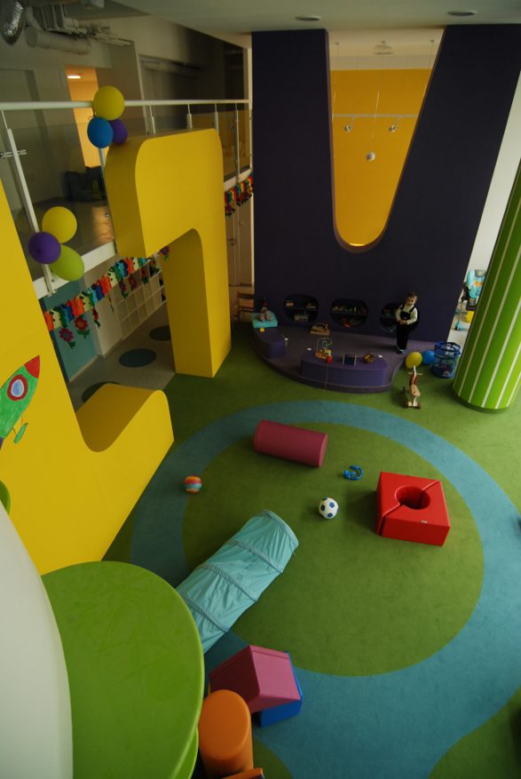
Bam Bam Studio overview
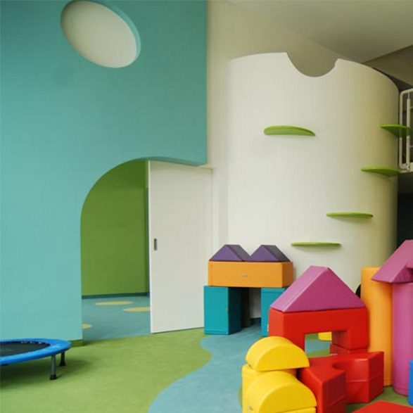
Hiding place in Bam Bam Studio (in the tower)
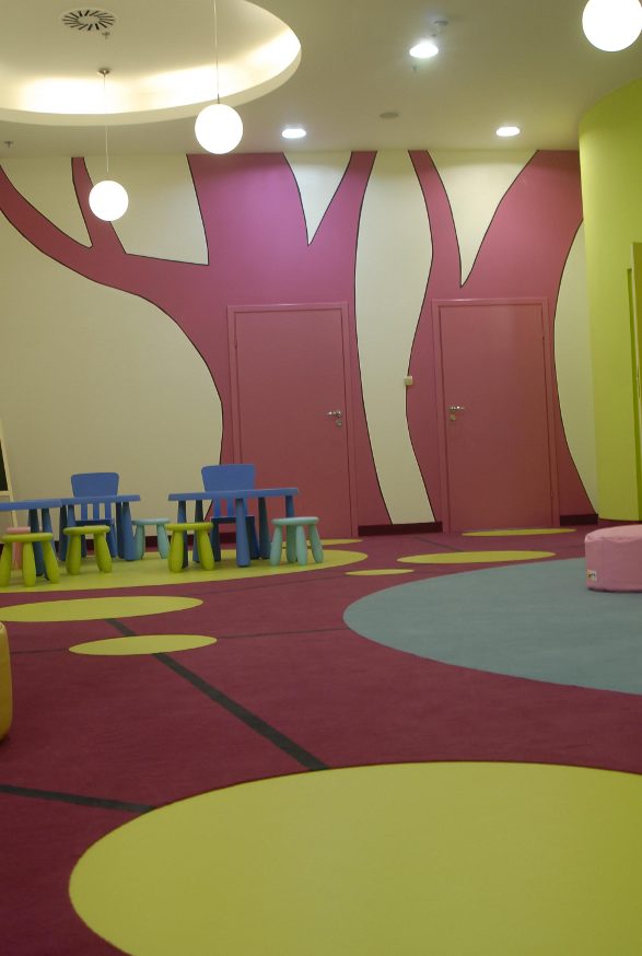
Abstract decorations in Edukado Kids Academy
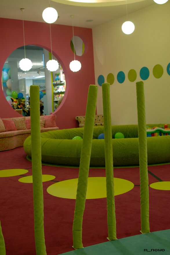
Separate space for babies in Edukado Kids Academy
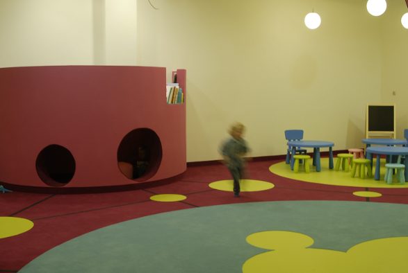
Hiding place in Edukado Kids Academy
Photos: archives of XYstudio


